Friday, July 24, 2009

They Don't Care About Us

Before the recent success of one-shot graphic "novels" like Blankets and J.Edgar Hoover:A Graphic Biography, all comic stories that I know of used to be serialized. Yes, this means that Maus, Watchmen, Cerebus, Ghost World, and most every other work of that nature published prior to this decade was originally produced in the thin, softcover comic issues (I've heard them called "floppies" that many new graphic novel snobs sneer at. Recently, I've done a lot of thinking about the fiction genre, and how it has a similar history to comics. Fiction was not always well-respected, and was considered more appropriate for kids than adults. Fiction was also serialized...it used to be unusual for a novel to come out as a one-shot, just as it is still more common for comics to be serialized today.

But fiction isn't really serialized anymore...and lately, it seems that more and more comics are skipping the traditional issue-by-issue release and going straight to book form. This means no amusing advertisements to look back on, no short 1-2 page "filler" comics or pages that display bonus artwork by other artists or fans. I originally read Dan Clowes' Like a Velvet Glove Cast in Iron in book form, which included the story alone. Years later, in a Seattle comic book store, I found some issues of Eightball, Clowes' comic series where Velvet Glove... was originally serialized. One issue contained an advertisement (not a parody) for a soundtrack to the comic which could be purchased by anyone. The soundtrack, by the band "Victor Banana," has a song for each chapter, cover art by Clowes, and vocals by Tim Hensley, another Fantagraphics cartoonist. Doesn't that sound like fun? It is obviously convenient to bind a story in a single book, free of advertisements or other clutter. It's easier to carry, and the reader doesn't have to sort through various pages of filler or other stories if they'd prefer to follow a single plot. But the above example hints that if serialization fades out entirely, there's a lot we'll be missing out on.

Here's another example: It's a page from the original run of Franny (of Franny and Zooey fame) in The New Yorker. I found it in the library's bound periodicals collection and photocopied it and then scanned it for you so you would have a visual aid! Please don't sue me, J.D. Salinger. This is fair use, right? A small snippet for educational purposes, and a review?


See? Isn't this neat? Look, the ads take up more space than the actual story does. Obviously, you'd want to get the book at some point. But for the first time reading this in the serialized form, isn't it cool to see all this contextual information? Perhaps Franny might have worn a dress like the one on the left. Or maybe Holden stayed at a hotel like the one in the lower right hand corner. It was only $4.00 for a single.

My point is, all the extra stuff that isn't the actual novel may clutter the pages, but it's also part of a historical document. It shows the kind of lifestyle these characters lived, or were at least heavily exposed to. Sometimes I look up old advertisements on the Internet for my own amusement or reference, but I never think, "Oh, I bet Franny went to a cafe like that, or smoked cigarettes like that." Not unless I see the story and the ads side by side like this do I make that connection. Zooey is even better:


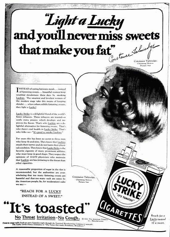
The most interesting ad on this page is the one on the bottom right corner. Exactly what kind of camp are we talking about here? Again, the ads provide a lot of information about the slang used at the time, the ignorance, and questionable sales ethics; information that the actual articles and stories in a publication may ignore or shy away from. The pages including Franny and Zooey didn't overlap with any blackface advertisements, but such ads existed in the same volumes. Even as late as the mid-50s. But all of this is a part of our history, and someone put a lot of thought into writing these elaborate old ads, or drawing/painting the illustrations. Not everyone had TVs in those days, certainly not in color, and in addition to providing a context for articles and stories, many of the ads are extremely beautiful, creative, and well-crafted.

In addition to acting as an ads/fun filler archive, serialization also allows readers, via "letters to the editor," to communicate with the creator/publisher during production of a story. Surely reader mail has had some effect on the plotlines and/or artwork of serialized comics and, earlier, novels. Without this communication, would a horrid inker (like, say, on par with Ty Templeton on The Exterminators) be commissioned to work on hundreds of pages, with no opportunity for outside protest along the way? Will creators shy away from experimental creative asides (like the soundtrack mentioned above), as they are typically absent from novels and anthologies? Has the slow fade of serialization affected the quality of fiction novels in any way, and will it affect the quality of comics in the future? Perhaps this is something I should research. This blog entry isn't very well researched; it's basically full of remembered information and personal musings.

When I find an article in an online database, it is free of ads and filler. This is good, because my print quota would quickly run out if every other page had a giant plug for Campbell's Cream of Asparagus soup or a recipe for a fancy celery-filled Jello mold that has nothing to do with my research. But by now it should be clear that the filler still has a very important purpose. However, it looks like those bits of history are heading for the dumpster or at least for storage, and current trends indicate that, in the near future, most comics, at least those targeted towards adults, might be published as one-shots, ending this archiving marriage of interesting stories within a greater cultural context. People don't really hang onto trashy magazines or advertising fliers. The only issues I hold onto are comic books, unless a magazine contains an article of a major historical event.

By the way, libraries weed books that are unpopular, but I didn't check out those giant, heavy, brittle New Yorker volumes, and returned them to their proper place on the shelf when I was done combing through them. I believe they were last checked out in the 1960s. One would think that only someone with my unique idiosyncracies, who is graduating next year anyway, would enjoy combing through 60-year-old periodicals as a pastime. But there's no way to tell, is there? Other than a careful viewing of library security camera footage.

Fun fact: Cosmopolitan (not in Syracuse's bound periodicals collection, but available at my old college) didn't used to be a cheap rag for cheap hoydens. It was a classy magazine that, in the early 20th century, taught women neat stuff like how to cook an omelet over an open fire. I thought maybe it was a different publication with the same name.

OKAY KIDS WAKE UP! Here's that silly comic I promised you earlier! It's a parody of a 40's-style prep school advertisement. You know, when I was a young girl, my mom used to put a "new" used book underneath piles of laundry I was supposed to put away. Eventually, I just knew a book would be there and took it without putting away the laundry, but hopefully you read my "boring" article anyway, rather than skipping to the end. And please let me know what you think of it (the article and/or anything else in this blog)!

As always, if the text is difficult to read, click on the image and it will appear in a new window and a new, larger size.


Ugh, my face is so greasy, breaking out. and I skipped the gym again today in favor of drawing the above spoof. It's like I'm 14 years old again, only physically, not mentally like always. It's the blog's fault. And yes, spellcheck, blog is a word now.

After awhile, dystophile!

Monday, July 13, 2009

Off the Wall

After Saturday's poster session at the American Library Association (ALA) conference, which I alluded to a couple posts back, my group members and I went our separate ways. Having spent some time in Chicago as a youth, I set off to Michigan Avenue to revisit some favorite old haunts. Sadly, it seems that not enough people watched the anti-P2P YouTube video that Ziyang, Zhuo and I created for our IST 618 Telecommunications and Information Policy course last fall semester: The Virgin Megastore and the movie theater across the street have gone the way of the dinosaurs. As an alternative way to kill time before my mostly non-vegetarian colleagues graciously indulged me in a trip to the Chicago Diner, I decided to draw some cityfolk.

I'm tired of drawing people sitting in cafes lifting forks to their mouths, so I searched around for some more inspiring fauna. And then I saw it: in the recently erected Millennium Park (built in 2004), a bunch of kids were actively playing in the fountain. Excited about capturing these action scenes, I searched for a civilized spot to sit. I was wearing a nice suit from the convention, and I didn't want to get grass stains all over it.

And then I realized that all the benches were set up so they faced away from the kids in action.

So, in the absence of properly oriented benches, I hoisted myself onto a short nearby wall, and sat and sketched as I planned, feeling like a creep though my intentions were as pure as new fallen snow.

Every artist that I know of and respect drew/draws from life to capture gestures and poses for practice and reference, and that's what I do, too. I don't know of anyone who can draft realistic, complex poses out of thin air, with no intensive practice in life drawing. Some draw from photographs, but I end up with stiff-looking artwork if I do that; it's very limiting, because a photo doesn't show you how shadows change when the sun moves, or which pose comes next in a natural flow, or any number of other things. It hinders invention, since a photo is just one frozen moment in a larger, fluid context. Anyway, that's besides the point since I guess taking pictures of kids is a complete taboo. Unless they're yours.

And so, though the Art Institute of Chicago (a couple blocks north on the same street as Millennium Park) displays at least two paintings by Balthus, I sit on this wall with the sneaking suspicion that what I'm doing is now considered socially unacceptable.


The plus side is, if I ever have to draw a picture of kids playing at a pool, fountain, or beach, I have some good reference material. It's really hard to draw moving little kids, but you'd be surprised how even a small gesture drawing of a hand or foot can be helpful later on.

Next time on Bibliowhining: Chrissy uses a new, modern tool (the Wacom tablet that R.David Lankes lent her) to draw and color something entirely on the computer! Will it be a failure of epic proportions, or will this Web comic meausure up to the rest? She hasn't tried it yet, so we'll see...

After a while, dystophile!

Monday, July 6, 2009

Remember the Time?

What's this strange, small, thin, clear device easily getting lost among the flotsam and jetsam of my desk?

Give up? It's an Ames lettering guide. While most cartoonists today simply use a computer font to letter their work, myself and maybe a few others stand by this Stone-Age relic. I'm glad someone else snapped up the "Bibliotechie" blog name that I wanted to use instead of "Bibliowhining," because in no way do I deserve the title. I drafted this blog entry in a Moleskine notebook. My no-frills cell-phone, on which I took these photos, began to malfunction. It wasn't used to all the attention, I suppose. I am not a techie, what was I trying to pose as? But back to my crafts.

I used the prehistoric gadget pictured above to letter a pamphlet myself and others handed out during a poster session on library science issues. Our poster dealt with the issue of special collections in public libraries. Should they sell the special collections or retain them? To learn more, you can squint at these images, come to the ALA convention in Chicago on Saturday for a repeat performance, or ask me about it and I'll exhaust myself answering everything you want to know.

However, as you may be able to appreciate from these "before" pictures, people complained that the lettering was too small. A "wall of text," they said. More white space would be nice, they advised. My poster session group, selected to attend the upcoming ALA convention, was self-conscious that the pamphlet's text layout didn't resemble that of a James Frey autobiography.

So now I'm going to letter the whole thing all over again.


The Ames lettering guide comes with a little booklet (which I have since lost), explaining how to manipulate it to do all kinds of calligraphic gymnastics, for example writing in italics. But I couldn't figure out the instructions to my satisfaction. Only a genius on the level of Einstein would be able to, I thought as I bemusedly flipped through the cryptic graphs and fractions peppered throughout the manual.

So, I use it to quickly create lines that are evenly spaced out. Nothing fancy. It works pretty well; much better than eyeballing it or using a ruler alone.

I hope some young (or old) would-be cartoonist, also a strictly hands-on type like me, comes across this blog and learns about this tool. I would never have discovered it if I hadn't read Dan Clowes' obscure pamphlet, the ironically titled "Modern Cartoonist," which features a drawing of this little gizmo. I took art classes in college, but the professors didn't really stress technical skills, or know anything about cartooning. I was on my own.

I like to use a dip pen for drawing, but with lettering, it's much neater to use a regular marker or felt-tip pen with a fine point. It's just less hassle, easier to control, and looks the same in reproduction anyway. Incidentally, check out how nice and long my nails have grown! That's because I don't work in food service anymore.


To make boldface words, I just use a pen with a thicker point. For regular type I used 0.5mm, and for bold I used 0.7 mm. I saved the bold words for last. I took a picture of this text block again, with the words in bold, but I accidentally erased it on my phone.


Erasing is fun, and I sometimes can't wait to do it, but it's a good idea to wait a few minutes so the ink doesn't smear.

And now, the ol' cut and paste! Literally, using actual scissors and a stick of glue, 23-skidoo! It doesn't get any more old-school than this, does it? You may have noticed that the desk I am using as my surface is different than my desk from the first picture. That is because I am at Pages Cafe, in my school library. I don't have a chair in my apartment, so I have to go elsewhere to work like this. Whenever I looked up, I caught another student looking at me with a funny smile or amused expression. I sure know how to make a spectacle of myself, don't I? Maybe I should sunbathe on the quad in next to no clothing, crisping my skin so that it becomes wrinkled and leathery in my late-20s. That's the normal thing for female students to do, right? Not design and letter pamphlets, that's WEIRD, and deserving of ridicule.


And here's the final paste-up! Thanks to my tutilage, you've learned an obsolete skill: Hand lettering that may have been passable in newspaper comics during the first World War. Can't see the difference between this and the before picture? That's because the only digital camera I have is on my cell phone. I'm no bibliotechie. But I hope you enjoyed this little lesson anyway.

And that's how I spent my day.

Man in the Mirror

Well, the recent death of the king of pop got me thinking a lot about the world he left behind, as well as my own life and what I've accomplished so far. Without getting too long winded, let's just say I listened to the song "Man in the Mirror" a few times, and decided that, rather then whine and complain about the lack of remaining culture/unique individuals/good music/etc. in our society, I should invite others to relate to me by revealing a bit of my own talents and thoughts. Yes, this blog is called "bibliowhining," but that's only because "bibliotechie" was already taken, not because I plan to be consistently negative. I'm a library science student, and I like puns.

So perhaps it's time to share my artwork with you. And until I get a digital camera, I'll start off with some old favorites.


"Librarians Are Stacked With Knowledge," Christina Spallone, 2009


The above is what I believe to be my most well-known drawing, a t-shirt design for the library science program I attend. If you look closely, you can see some suggested puns in the bottom left hand quarter: "Fully Stacked," and "Abridge to Success". One of my colleagues (I'm not sure who, or I would give him/her credit) cleverly, and to my delight, enhanced the original pun to read, "Librarians are Stacked with Knowledge!" as you can see in the finished products below. This image has popped up in other librarians' blogs, but none so far have detailed it's storied background. Allow me to fill in the gaps:


I am a kind and gentle person, but I am also very quiet and solitary, which unfortunately makes others afraid to approach me. One day, I was on Facebook, and I received a message in my inbox inviting any and all to participate in a t-shirt designing contest for the Library and Information Science program at Syracuse University. It was clearly bait; my colleagues knew I could draw because of my work on a past project. The thing is, in addition to my three classes, I worked 40 hours a week at a fast-food restaurant, and had a second, part-time job assisting my advisor/boss with various proofreading tasks. Drawing is fun, but there was no time for fun time. I didn't bite.

The next day I sensed something fishy was going on. I had class with these two girls Leslie and Katy, and they brought me some cupcakes they had merrily prepared before class, while I was finishing up my 8.5-hour shift scouring dried-up meat sauce from a dirty cambro. After eating the cupcakes, I became very sleepy. I just blamed the sleepiness on my nonstop schedule of work and school, and thought nothing of it. "Thank you."

After class, I felt a gust of wind behind me. Someone threw a garbage bag over my head and dragged me to the corner! Ordinarily, I would have been able to overpower this fiend, but I was feeling sluggish. I don't know why! Immediately, I felt a sting in my side as two sets of soap-in-a-sock began to pound me, all over my body, most painfully on my hipbones. I looked around (the garbage bag was thin enough that I could see through it) for a camera crew from PETA so that maybe someone could learn something from this gratuitous and senseless display of violence. But I saw nothing, only cruel and laughing faces all around me. I agreed to find the time to draw the t-shirt design they wanted so desperately from me.

That day, after class/the bludgeoning, I went home and spent an hour or two sketching my design in pencil. I had to work quickly so that I could wake up at 6:30 in the morning to get ready for my 7:30 AM shift at the fast-food restaurant. After completion I sent Leslie, one of the girls I mentioned earlier, a text message saying she could meet me in the restaurant to preview the design draft. I was in charge that day, so I thought it would be okay if she met with me for a brief cavort.

At 5:30 PM, there she was, standing there waiting for me. After finishing the sandwich I was working on and ringing the customer up (the foreign employees I was working with didn't know how to work the cash register yet, or the English names for any of the meats and vegetables), I brought out my design to show Leslie. She thought some of the proportions were a bit wonky, but overall gave me a thumbs-up. After Leslie left, the boss, who had been watching the live surveillance cameras, called and said she saw me goofing off talking to a friend. I would receive a writeup and a decrease in pay. Then she told me my chores for the night: I had to clean out the oven and the toaster with a scouring pad, then prep 3 tubs of jalapeno peppers, in that order. Yeow!

That night, after arriving home at 11:30PM, I worked quickly to ink the design so I could get a decent nights sleep before my 8AM shift was to begin the next morning. When morning came (a Saturday), I called Leslie to ask if she would like to see the finished product. She was unavailable that day, but penciled me in for two weeks later.

When the t-shirts were made, many kids in class took pictures of each other in their matching SU wear. Of course I was too bashful to take part in any of it.


Okay, so that's the history... or should I say HERstory? It seems that I have unfortunately offended some feminists with my t-shirt design. While most think it puts the dandy in Dan DeCarlo, others believe that this shirt is disrespectful towards librarians. Actually, I have never heard a harsh word said against the librarian profession, except the stereotype that they are plain (in appearance) and cranky. But I don't think the shirt perpetuates that. And -- those stories about being beat up and everything were just silly and made up, but this is the honest truth -- I'm sorry to put this image in your mind, but, as one person already figured out, I was the model for the design (not the face, though; I invented that). Going back to the "Man in the Mirror" theme, I drew everything at home by myself, so the only way to get the pose right was to put on the outfit in the picture, pick up some books, and pose in front of the mirror. I don't usually look like that in public due to my bad posture and conservative dress, but that's how it went down.  It's not perfect, but I'm sure no one will disrespect the profession of librarianship as a result of this t-shirt. It shows that librarians can draw, model, and lift heavy stacks of books.